Share
When it comes to designing a website, we often focus on what's trending and the visual aspects of the design. Making sure that the design is modern and in line with the current trends. What's often overlooked is the typography and its importance in web design.
According to latest research, web designers focus shouldn't simply be on bringing a message through writing but also making sure that the words are laid out properly.
Throughout history, typography has played an important role in design since the very first prints rolled out from a printing press. Nowadays you can easily see that typography is at the heart of creative design, a vital piece of delivering a message on any well done website or app.
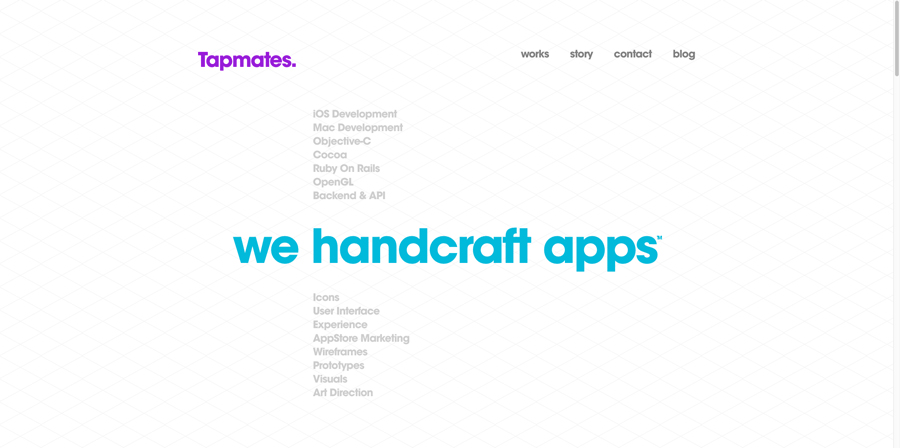
The difference between web pages and publications through print is that web pages have unlimited space. With that said, visitors shouldn’t need to go to endless scrolling. Instead, focus on creative typography, creative layouts and delivery methods. We can find a good example of this on Tapmates.com. The app developer uses typography to deliver a clear message to its visitors. Large blue letters against a clean white background say, "We handcraft apps," this way informing its visitors what Tapmates is all about. One might say that they didn't put much effort into explaining what they're all about but that simply isn't true. Current industry trends are more about keeping things short, simple, clean and informative.
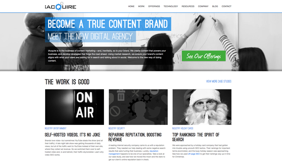
What's in is the use of various fonts and accents to differentiate text, use of bold fonts to create a sense of hierarchy and lighter fonts to put less emphasis on information that is not as important. There is a balance that must be achieved. This new trend can also be seen put to use in social media platforms such as Google+. A good example of this can be seen on digital agency iAcquire's Google+ page.
According to the Canadian designer, Bruce Mau, some of the best examples of typography are usually found mounted on canvases of negative space. Bruce seems to think that designers tend to overload their websites with an abundance of visual stimulation, which results in clutter and unprofessional web design. He suggests a simple method of testing whether or not your website is over-cluttered. First, reload your website and close your eyes. Once you open your eyes, try to remember what grabbed your attention first. If it isn't the focal point that you want your visitors to see then you may have to make some changes to your layout, or content.
Some of the things to consider are alignment, line spacing and content hierarchy. If we consider alignment then we should probably consider that people read left to right, thus making sure that the content flows naturally. Line spacing is the other. We should consider whether, or not to condense a paragraph or space it out. In terms of hierarchy, we should consider consistency in layout, font, font size and colour choices. For an example, emphasis should be put towards what is a headline, what is a button and so on.
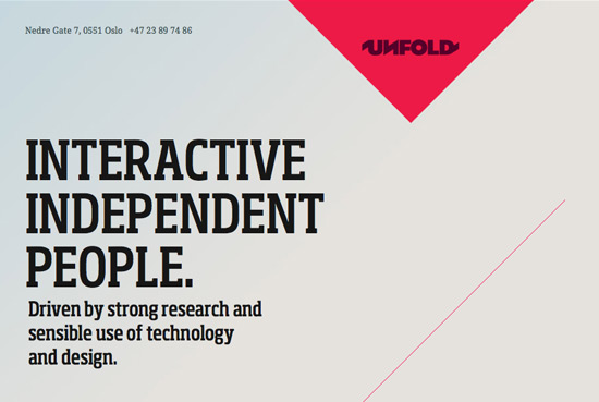
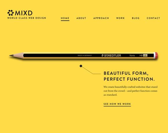
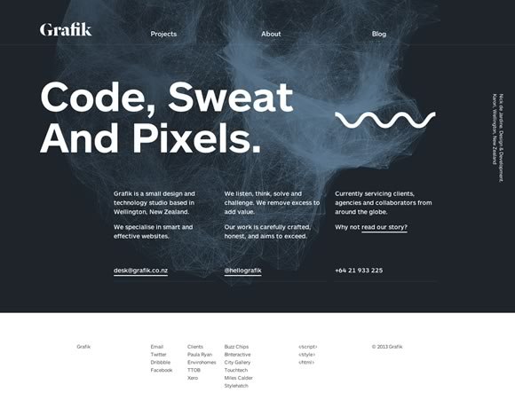
Below are some good examples of this being put to use.