Share
In the days of an excessive society where everyone seeks the biggest, fastest, and loudest, it’s surprising that design is moving in an entirely opposite direction.
The world of flat and minimal designs is emerging. Granted, minimal design has been around since the 60’s to early 70’s, but never before has it been this notably predominant in the UI community.
Minimalistic design is not intended to leave the user flabbergasted with its sparkly animated GIFs, seizure inducing banner ads, 20 pixel drop shadows and inner glows. Instead, minimal design is so much more. It’s the beauty in the whitespace. More thought out and refined. It’s displaying content in the cleanest, simplest and most intuitive way without the bells and whistles, while always being constructed around the user.
“Flat” layouts in particular are taking the design world by storm. Concise layouts with subtle colour groups and little to no harsh blacks and whites. Eliminating the non-essentials. The design community is slowly paving the way for websites to showcase content first, instead of trying to jam as much as they can down the user’s throat with embellishments. The new Windows 8 operating system has been touted as the unofficial pioneer of the newly acquired “Flat” styling, moving away from the skeuomorphic look.
Now is it here to stay? Like any trend, I presume it will have a shelf life. However I think the “flat crusade” means more than just the aesthetic appeal. It’s based around content, usability and the user; which I believe is a trend that will never fade away.
Here are some of my favorite examples of Flat design.
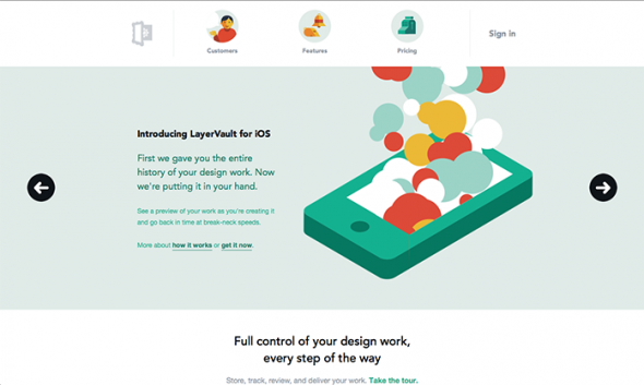
Layer Vault
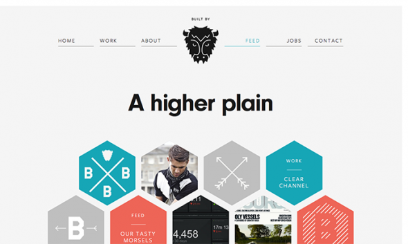
Built By Buffalo
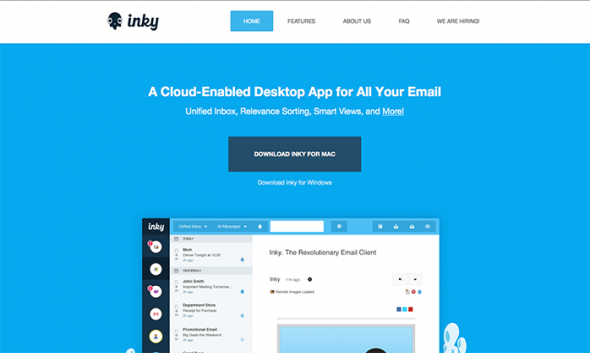
Inky
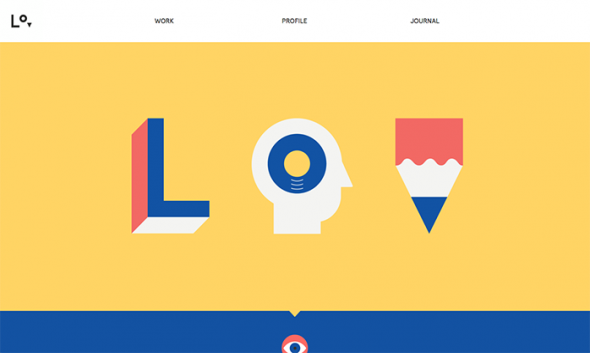
Lorenzo Verzini
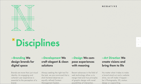
Negative Labs
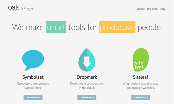
Oak
Vine