Share
Setting your company's colour standards is a small detail with far reaching and potentially expensive implications.
It's common for organizations to have communications materials that don't quite match. Where these problems can be apparent is in a trade-show environment, when business cards, brochures, sales sheets, promotional products, multimedia and the booth itself, are all in on top of each other. Colours that seem the same on their own are suddenly obviously different when placed next to one another.
Why don't the colours match?
And more importantly, how can we deal with this once and for all so that your corporate colours are consistent no matter where they are printed?
Why don't the colours in some corporate materials match?
The why is usually blamed on the printer, and the mysterious magic of colour matching. However, more often it's a problem of colour ambiguity early on in the branding process that never was dealt with and has spread throughout the company. Here's an example...
An agricultural genetics client with offices around the world wanted to focus on their global marketing, remove redundancies, and save money. Right away we realized that their corporate colours were a major issue that had to be dealt with. The colours were simple, blue and grey. But they didn't match. All of their offices were using different colours thinking that their colour was the right one. When their marketing materials were placed together, they did not look the same.
Does it really matter if our materials are close but don't match?
Imagine walking into a restaurant to meet a friend for a lunch date. You've heard good things about the restaurant are are excited to take your friend there and have a relaxing meal while you catch up. You're looking forward to some great food and great conversation. The atmosphere for the restaurant is warm and pristine. But something catches your eye as you find your seat. You can see into the back of the restaurant through the kitchen door. You'd expect to see stainless steel counters and lots of light, but instead you see a darkly lit room with old boxes awkwardly stacked almost to the ceiling, disorganized. You don't think anything of it and sit down. And yet, a subtle thing happened and you are not the same. Did seeing the boxes change the quality of the food? No. Did it change the experience? Yes.
A client won't likely notice that your communications materials don't match. But they may say to themselves, "I don't know what it is but something isn't right here." Just like the stacked boxes diminished the restaurant experience, mismatched corporate materials put a dent in the brand experience you're no doubt painstakingly cultivating.
What caused the colour issues with the agricultural genetics firm's brand?
It likely it started with the design agency that created their logo and then snowballed.
Designers often mix their own colours on the screen to create a CMYK formula which matches what they see in their mind. (CMYK formulas are a mix of the 4 colours used in full-colour printing - Cyan, Magenta, Yellow and Black - and each colour has a number of 0 for no colour to 100 for maximum colour.)
Let's say the logo designer came up with a blue for the logo whose CMYK colour is 90/20/0/40.  The client loved it and approved for the logo. So far so good.
So now the client wants business cards. Here's where we run into the first problem. The client looks at a proof for the business cards and doesn't like the way that Blue 90/20/0/40 looks on paper. Unfortnautely CMYK is not a tool for matching colours from one printer to the next. Colour results depend on many variables including machine type, print settings, ink type, and paper type. A CMYK formula will not produce consistent colour. The client asks the printer to make some adjustments.
Following the client's instructions, the printer adjusts the CMYK formula to better match the blue his printer is producing to what the client wants. Now we have two blues:
A. The original blue: 90/20/0/40.
B. The blue the printer adjusted: 90/10/0/50. 
Can you see the difference? They're similar, but not exactly the same.
Both the logo and the business card files are then sent out to the regional offices. Simultaneously, two of the communications team begin work on new projects with the new logo and cards in hand. One needs a promotional mug created, the other is building a trade show booth. In both cases the respective printers need to know what Pantone colour to use. The Pantone Matching System (PMS) is a colour matching system.
For the promotional mug, the designer who created the logo provides a Pantone Matching System colour, Pantone 7469 C  so that the mug can be printed using a single spot colour instead of the CMYK system used on paper. The problem with this colour is that that although it is close to the original CMYK colour, it's not the original colour.
Now we have three colours...
A. The original blue: 90/20/0/40.
B. The blue the printer adjusted: 90/10/0/50.
C. The Pantone blue that is close to the original logo blue: Pantone 7469 C (CMYK 100/59/31/11).
This happens again in the creation of the trade show booth, but since the booth designer was given the business cards files to use as a starting point, she chooses a fourth blue. Another Pantone colour, this time based on the business card printer's CMYK formula. Yet again the colour is matched to the nearest Pantone. Again it is similar, but not the same colour. Now we have 4 colours after only 4 projects...
A. 90/20/0/40.
B. 90/10/0/50.
C. Pantone 7469 C (100/59/31/11).
D. Pantone 3025 PC (100/17/0/51). 
Each of these colours are used for new projects by the different regional departments, all thinking that their version of the colour is the right one.
Before long people start to notice that the colours aren't working together and want to do something about it. For the agricultural genetics client I mentioned earlier, this is where we came in.
Gaining Colour Confidence
Getting your corporate colours right early on will save you money, not to mention the headache of tediously tracking down all the colour problems and fixing them later.
Here's how to produce consistent colour in your materials:
1. Pantone First!
Start with a Pantone colour. Because Pantone colours are a true colour match that each printer can reference, knowing your Pantone colour is the first step in the process. Every printer can test against an exact match by referencing your Pantone colour in their Pantone swatch book.
2. Check the Pantone Book
Check your Pantone colour in a Pantone book. Any printer or designer you work with will have a Pantone book for you to review. Make sure your colour looks exactly right in the book, and not just on your computer screen.
3. Check the CMYK version of your Pantone colour
Matching CMYK is Critical. Check the Full-Colour Process (CMYK) version of your Pantone colour. Most of the printing you'll do will be using Full-Colour Process that uses CMYK, so you need to check what the colour will look like when printed in CMYK.
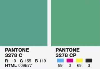
As you can see in the sample of Pantone 3278 on the right, the 3278 C spot colour (left) is not an exact match to the 3278 CP process colour (right). This is because CMYK can't reproduce every possible colour, so the closest match is what is shown. Some spot colour (left) and CMYK (right) combinations are virtually the same, but greens and oranges are likely to be noticeably different.
If you plan to work with colour often, consider purchasing your own Pantone book. Make sure that it shows the CMYK version of the colours like the Pantone book at this link: https://www.pantone.com/
Create a quick-reference colour document
Once you have your Pantone colour, use it as the starting point to create a simple colour standards quick-reference document (or have your designer do it for you.)
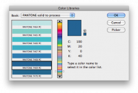
- In Photoshop, open the SET FOREGROUND COLOUR window and click on COLOUR LIBRARIES.
- Choose the Pantone colour in the "PANTONE solid to process" menu. This will show the CMYK colour formula.
- Click on PICKER to see all the colour formulas for your Pantone colour.
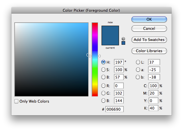
- In a text document, note the Pantone colour name, the CMYK formula (for print), the RGB formula (for monitors), and the HTML Hexadecimal formula (for websites.) The formulas for a standard set of blues from the example above will look like this:
Our Company Blue: Pantone 7469 CP, CMYK 100/20/0/40, RBG 0/102/144, HTML 006690
Distribute your quick-reference colour document
Everyone who is producing materials for your company gets one.
Ask printers to match to your Pantone colour
Whenever you send materials out on a print job, tell the printer your Pantone colour(s) to match the document to and, if possible, give them a sample of your current materials.
Two key points to note
1. The process is not reversible
If you reverse the process and start with, lets say, the HTML hexadecimal colour, you will get a different CMYK number and a different Pantone swatch. This is because each colour formula doesn't exactly match the others. The reason we start with a Pantone colour and it's CMYK mix is that this is the critical colour we need to match for printing. From the Pantone colour we can get reliable CMYK, RGB and HTML hexadecimal colour, but not the other way around. If you start with CMYK, RGB or HTML hexadecimal, you'll end up with a similar, but different colour when you go to print and will have to go back and adjust the other colour formulas once you establish your Pantone colour.
2. Printing is subject to a lot of variables
Even when you use this system, you may still get colours that aren't a perfect match, but at least you've done your part to ensure great colour matching. Ask for proof before printing begins and check the proof against your Pantone colour.
Related Chatter
 Chatter Community
Let's Make Marillac Merry
It's a Mad Hatter tradition to donate to the Marillac Place for the holidays. We are extending the invite to contribute along with us this year. Donations can be in the form of canned goods, gently used (or even new) women's and children's clothing - up to 24 months preferred.