Share
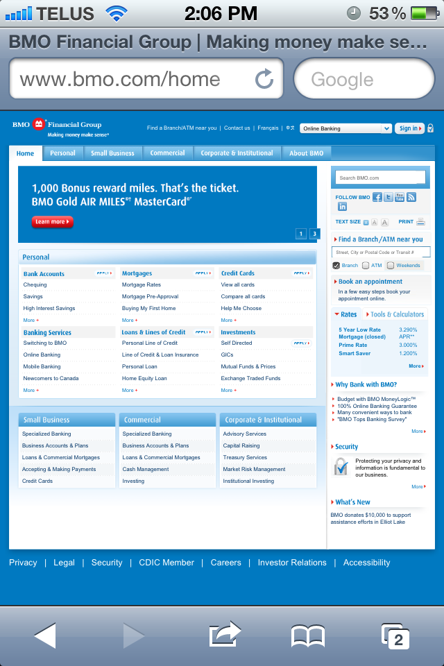
We’ve all been there. You’re scrolling through your news feed and come across a headline that leads to what should be a great article. Or perhaps you need to do some banking on the go. The problem? The page opens and looks something like this:
Frustrated or indifferent, you either try to wend your way through the site or you simply continue to browse other pages. The bottom line is that it's not enjoyable and odds are you'll avoid the website altogether once you know it's not mobile friendly.
In a world full of content-hungry consumers, businesses simply can’t afford to gamble on a web design that doesn’t work across multiple devices. Responsive web design is an innovative solution that will ensure tablet and mobile compatibility.
Here are three key benefits to building a responsive website:
Your clients are moving, and responsive web design allows them to bring you along. According to Cisco, smartphone usage accounts for over 82% of total global handset traffic. Mobile usage has doubled annually for over four years, and is expected to continue to grow at an even faster rate. Responsive web design gives your business a tremendous opportunity to reach the right people, whether they’re on a laptop or on the go.
Responsive web design improves your search engine optimization. When your site is mobile and tablet friendly, you’ve opened the floodgates to bringing in more traffic to your website. Key messages are highlighted while enhancing branding consistency. Remember, search engine results pages rank according to the quality of the content and overall user-experience.
It’s cost-effective, low maintenance, simple and resourceful. What's important is that the content is re-ordered in such a way that the user can accomplish what they need to on your website (sign-in info with buttons that are "big-hands" friendly, key contact info is easily visible, etc.)
Here's a brilliant example of how responsive web design looks. Notice how the architecture of the website adapts to the screen size.
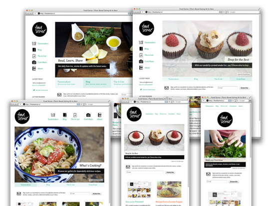
To try it yourself, check out http://foodsense.is. Resize your browser window to view different layouts. Do you have any favourite responsive websites you’d like to share? Interested in learning about how we can help you build a responsive website? Contact us!